

opening


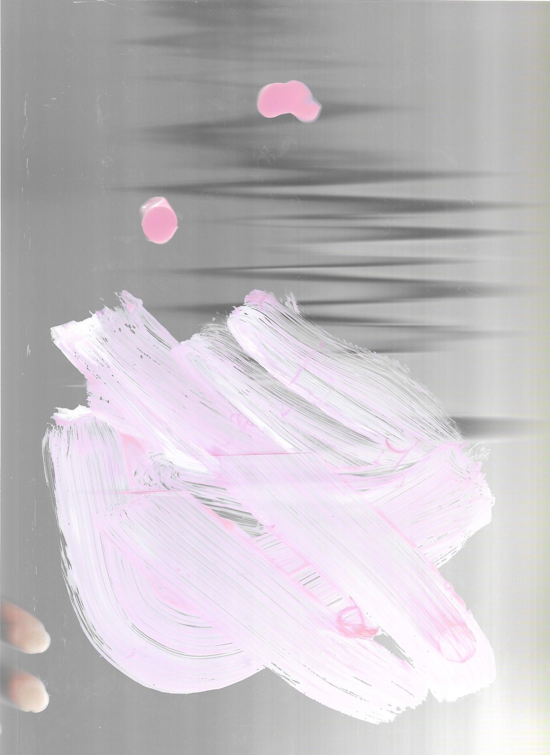
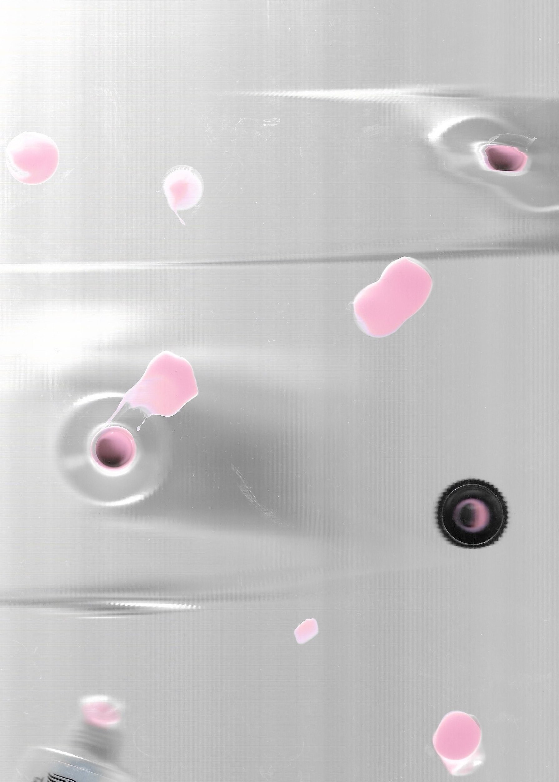
This residency was approached from the edge and through queerly tinted hues.
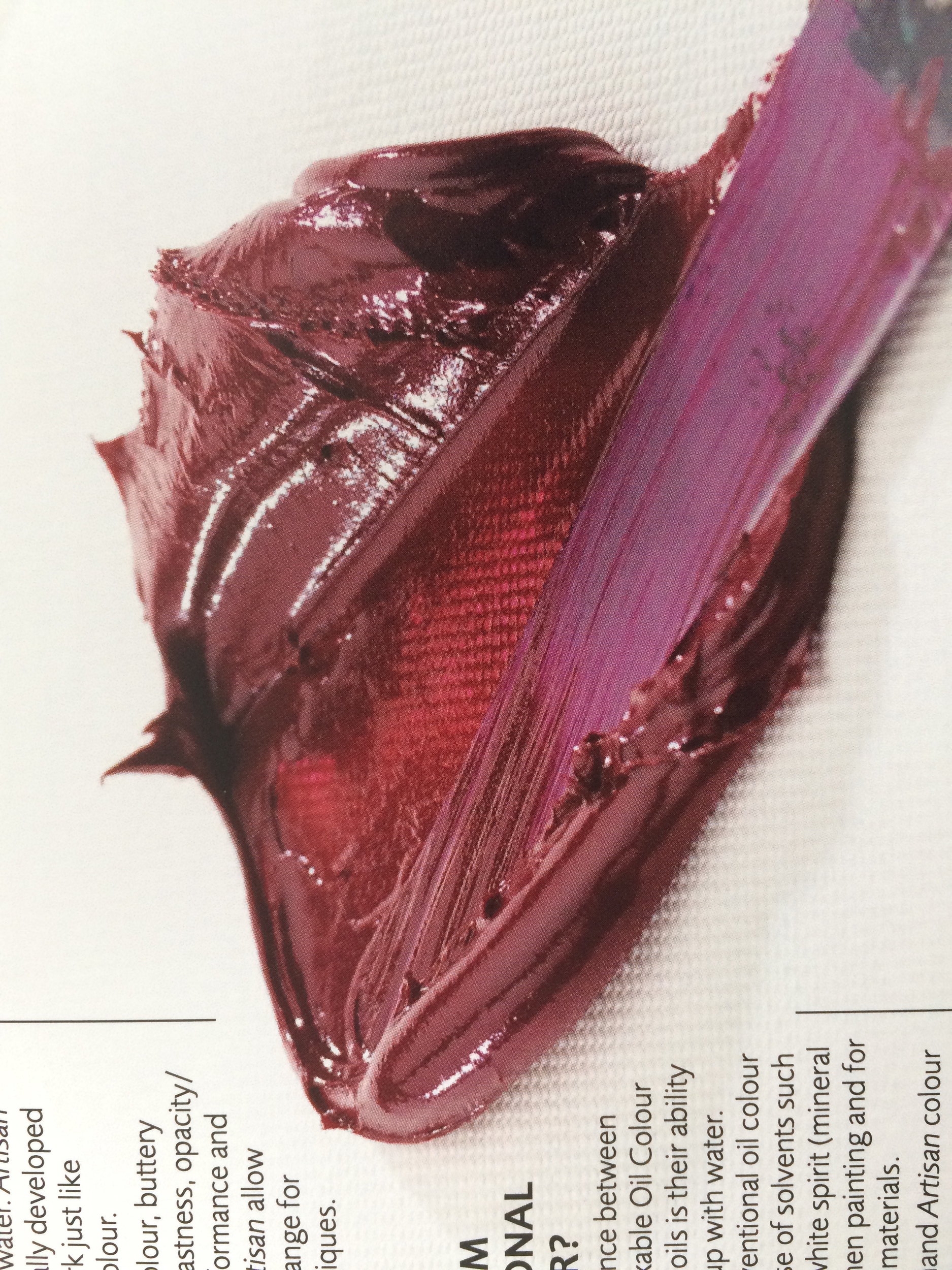
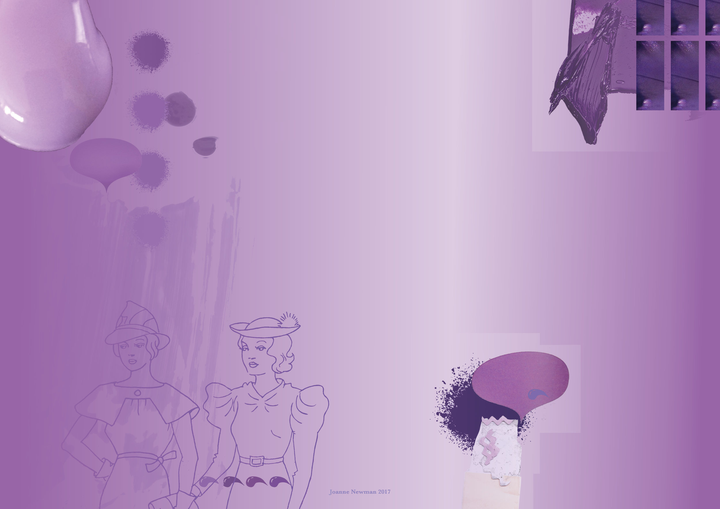
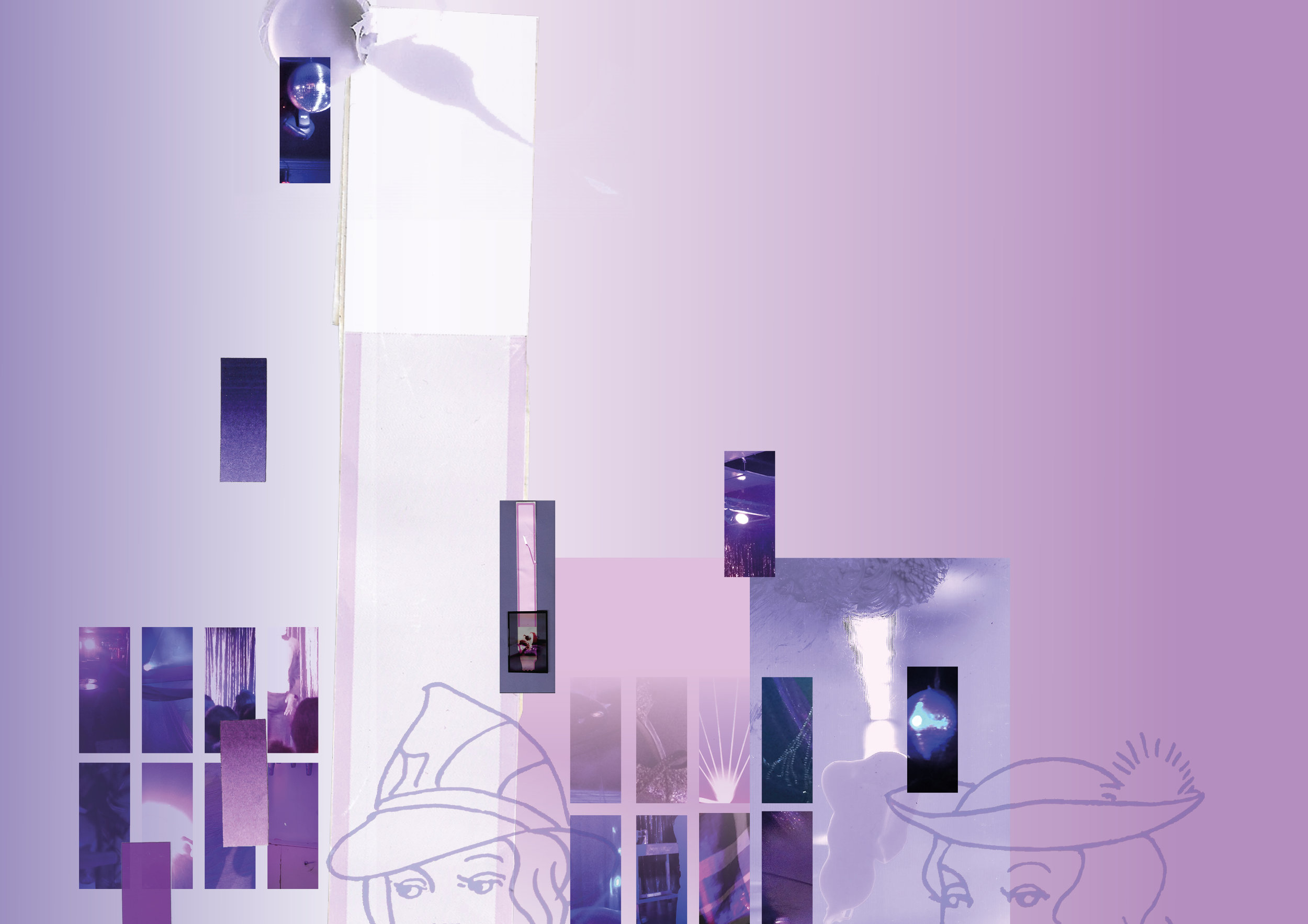
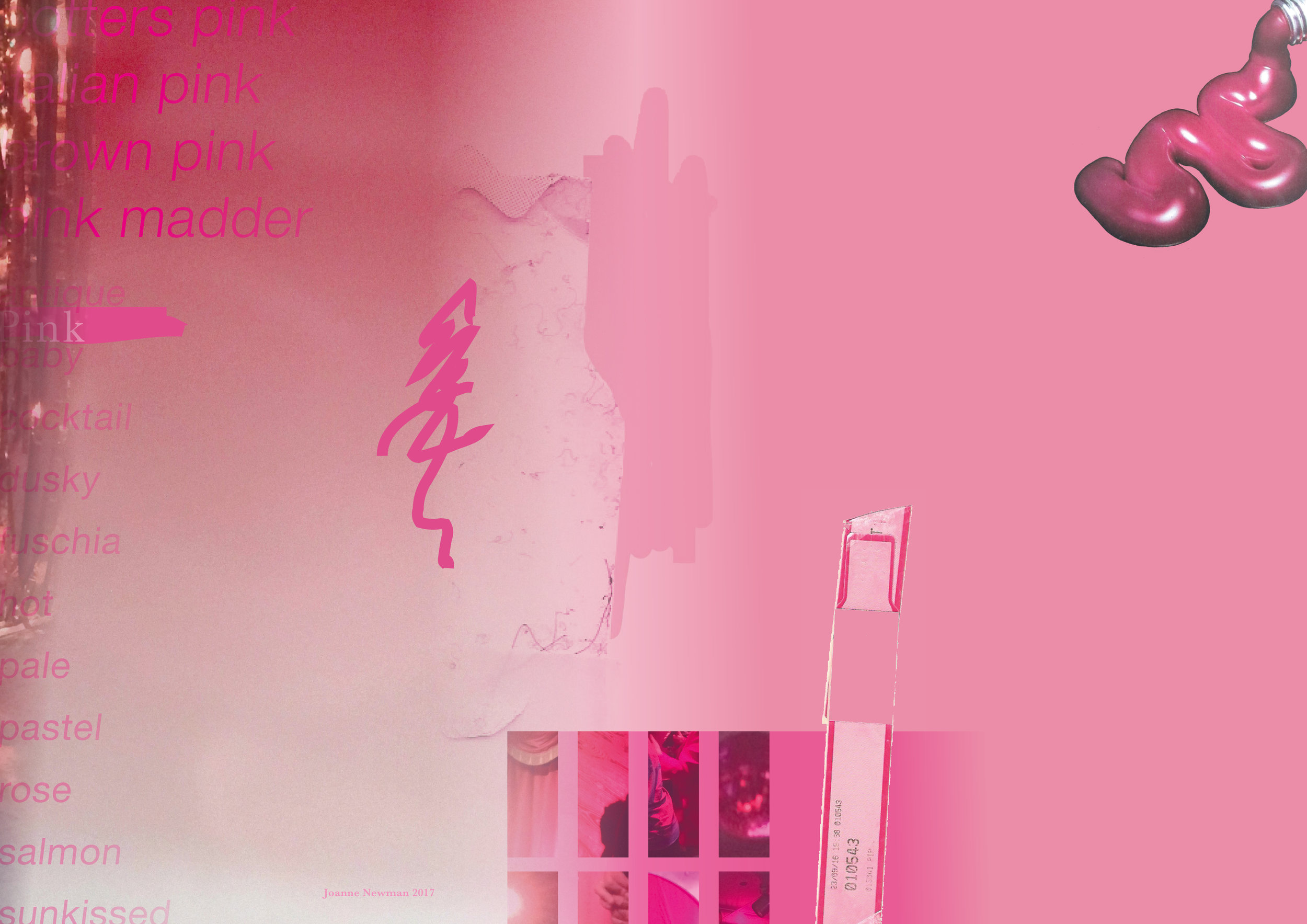
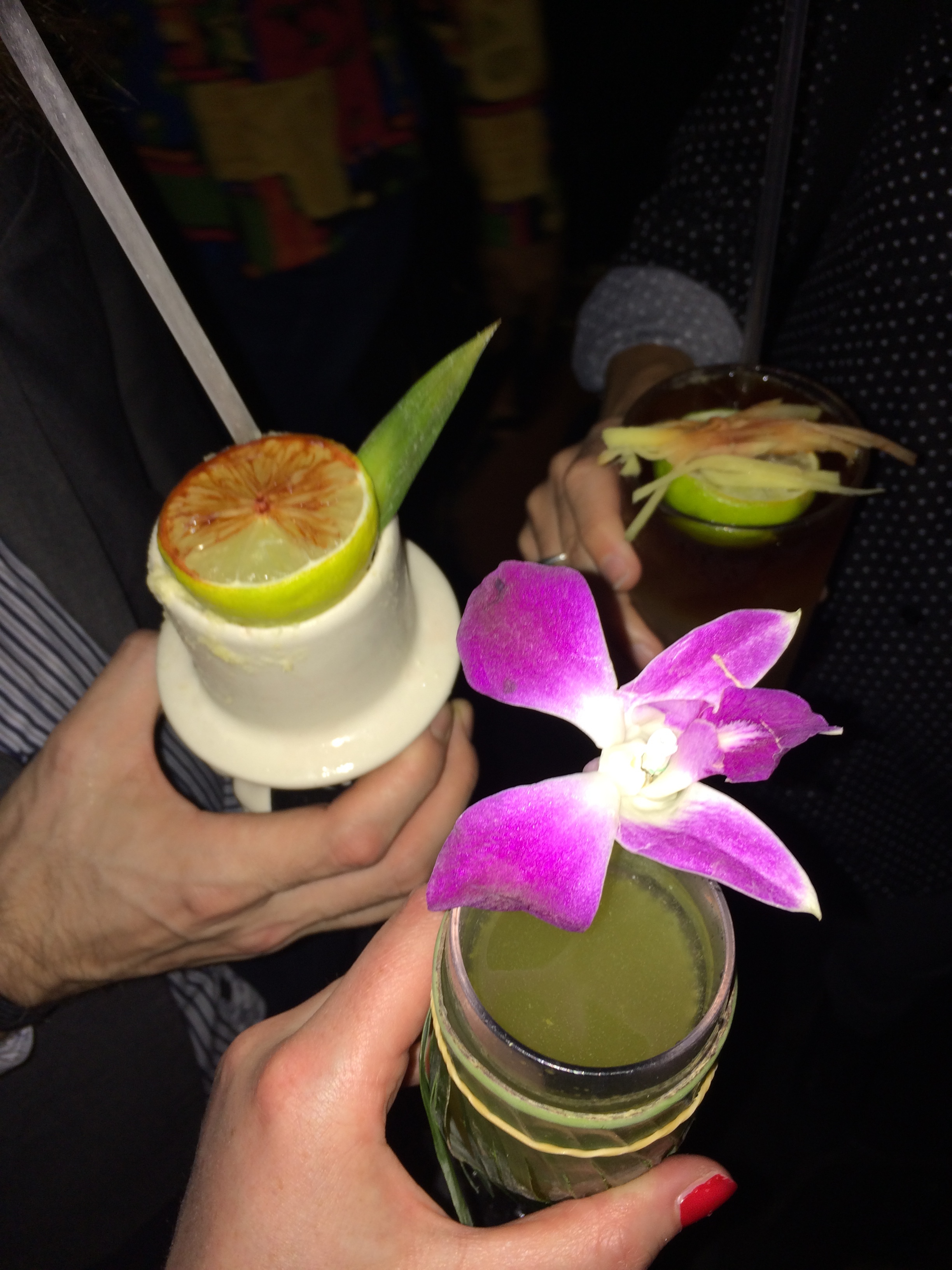
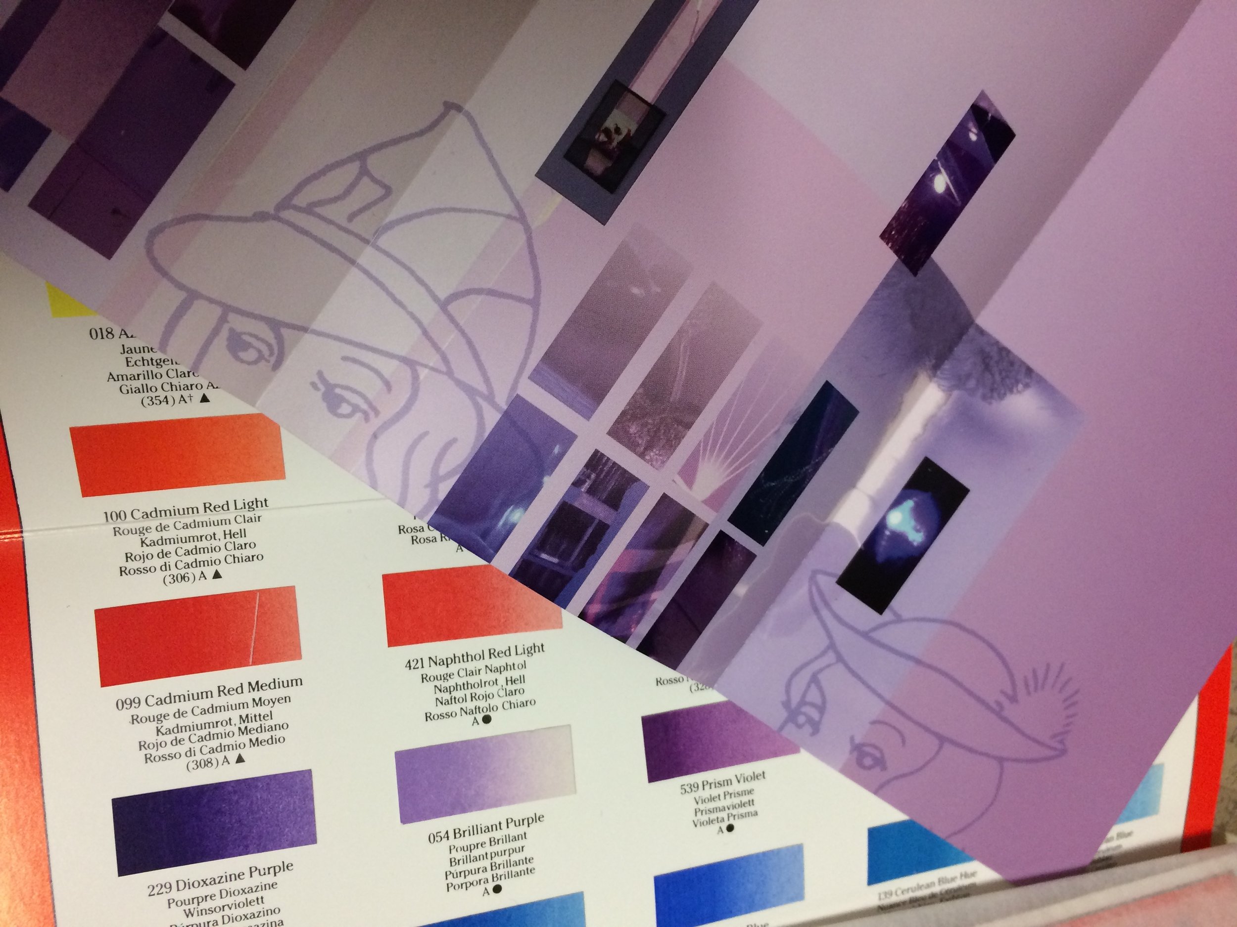
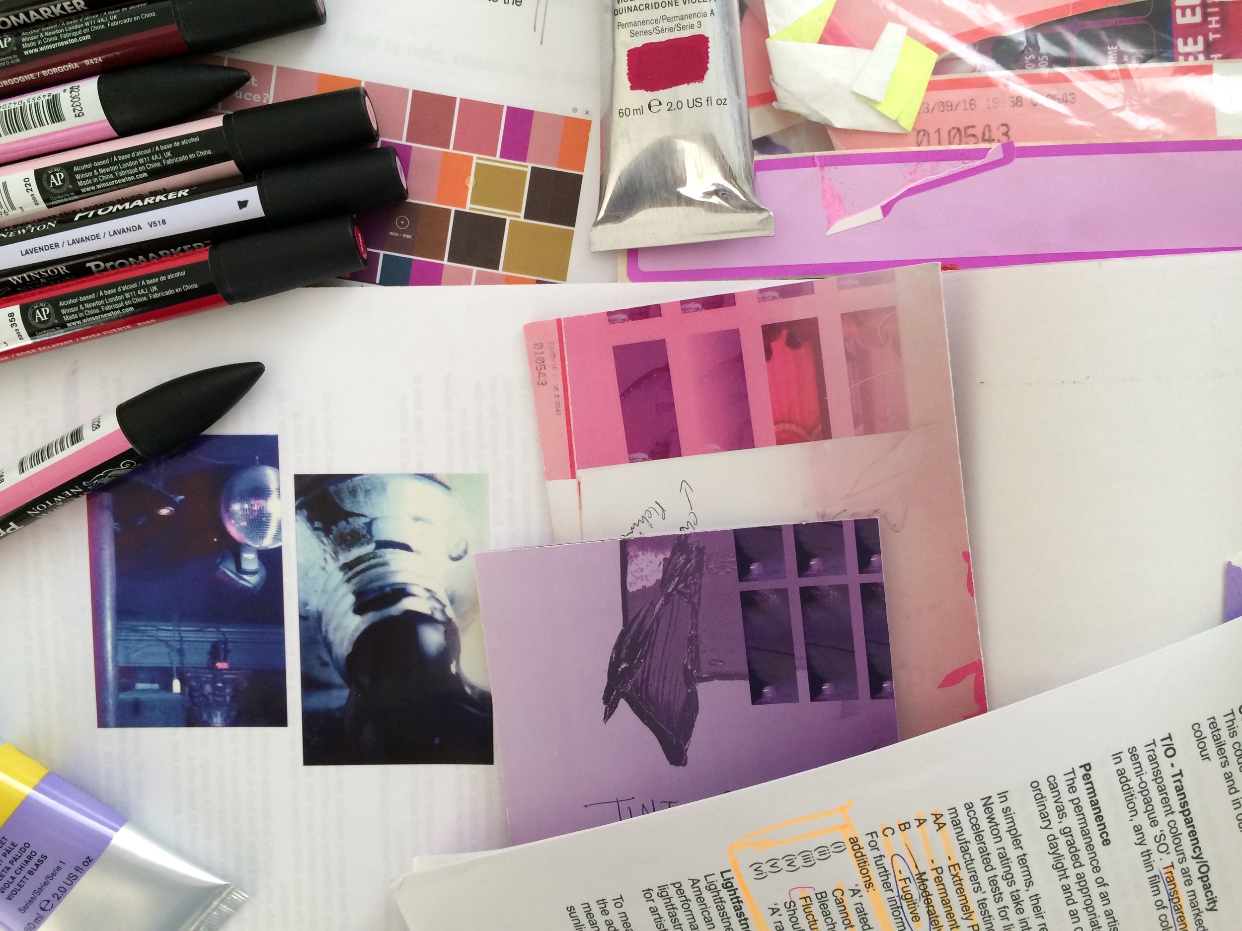
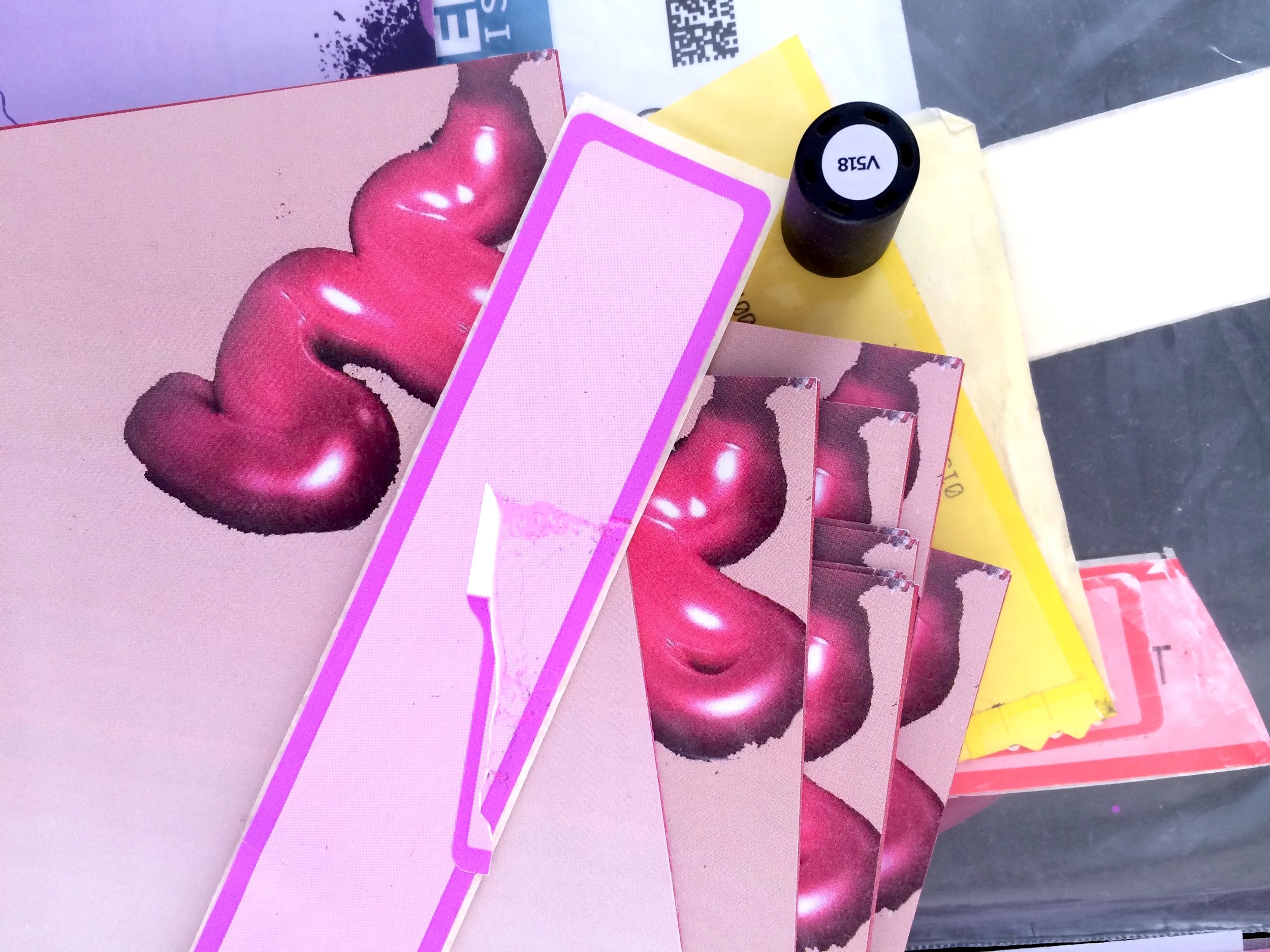
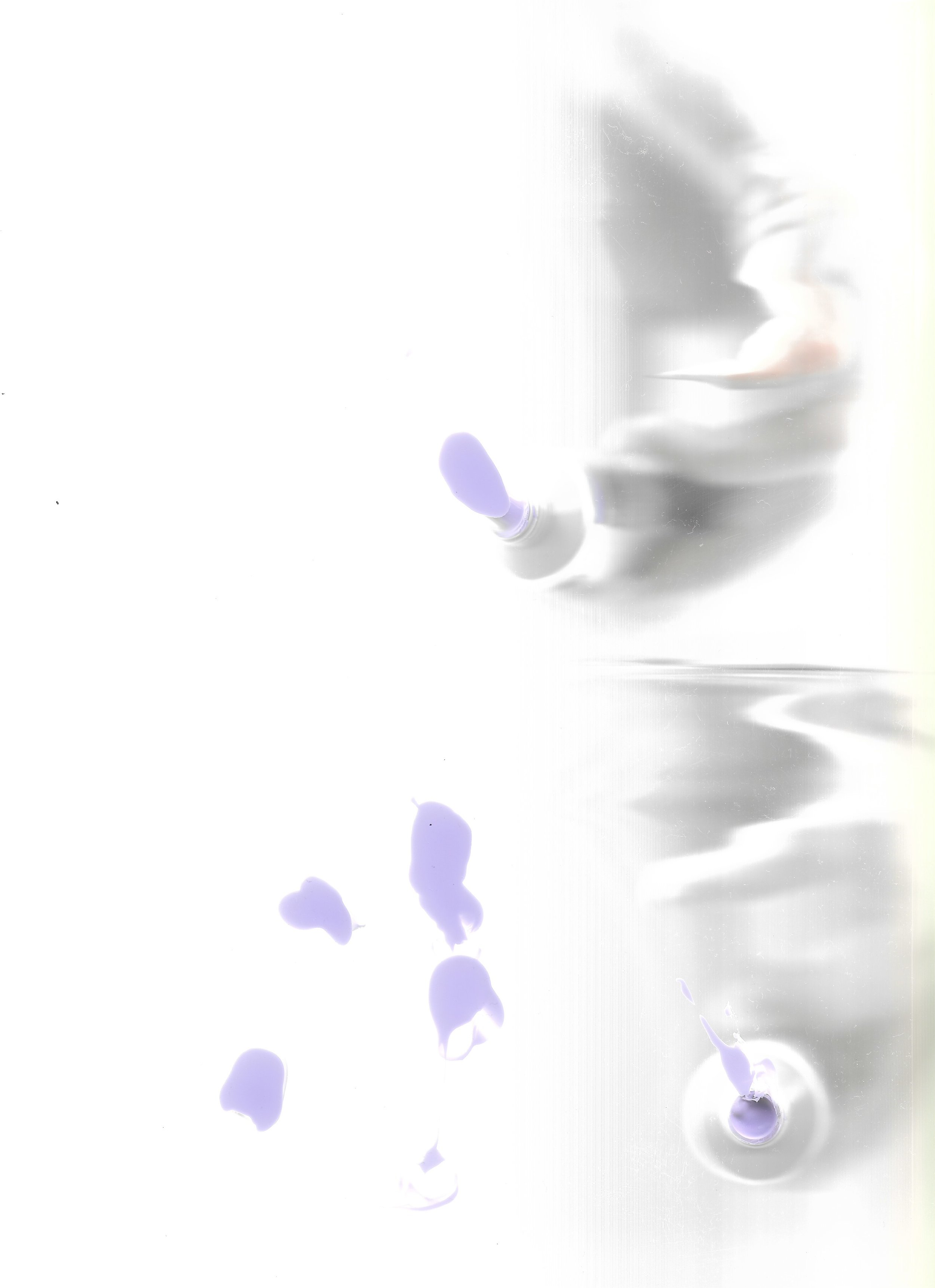
Pink, puce and lavender.
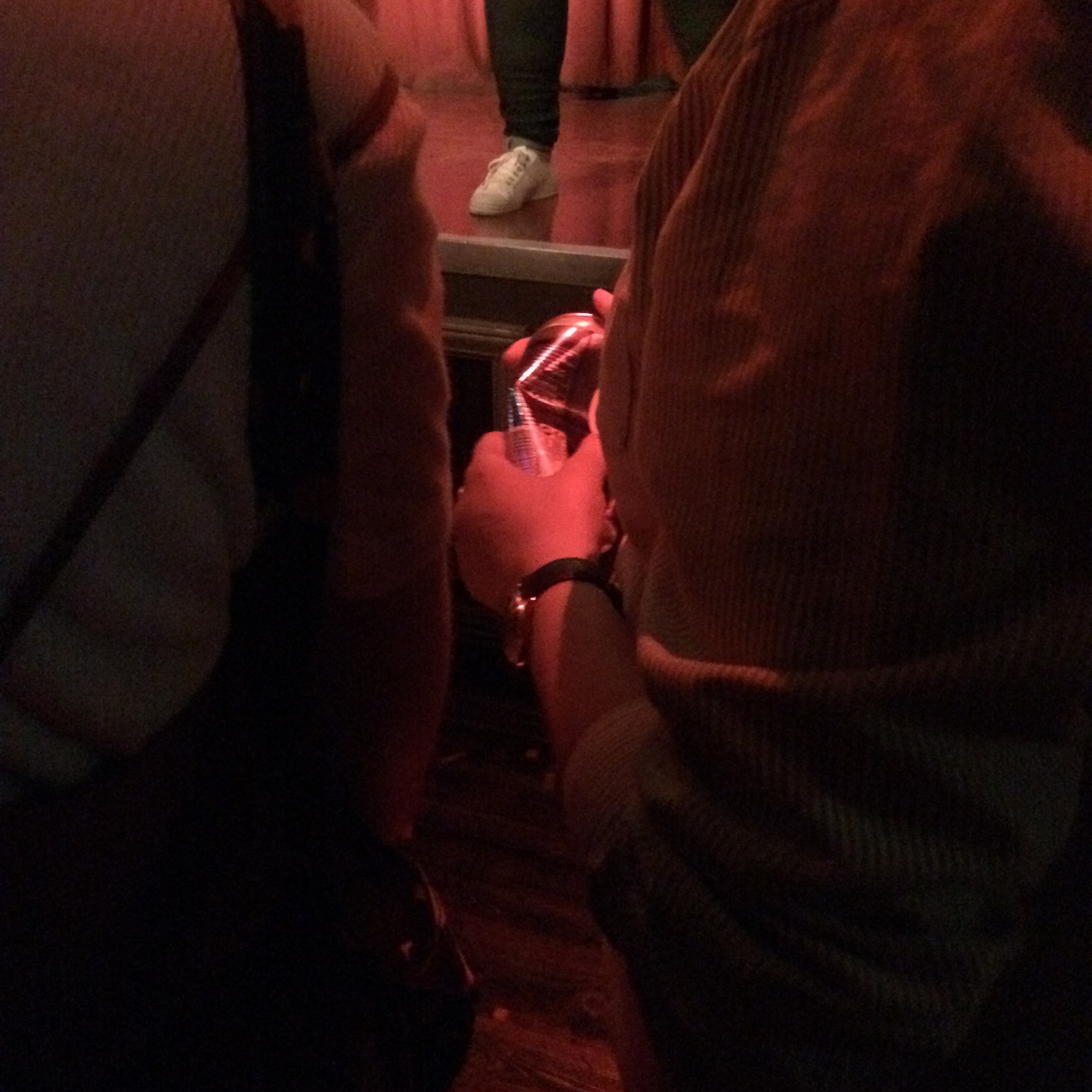
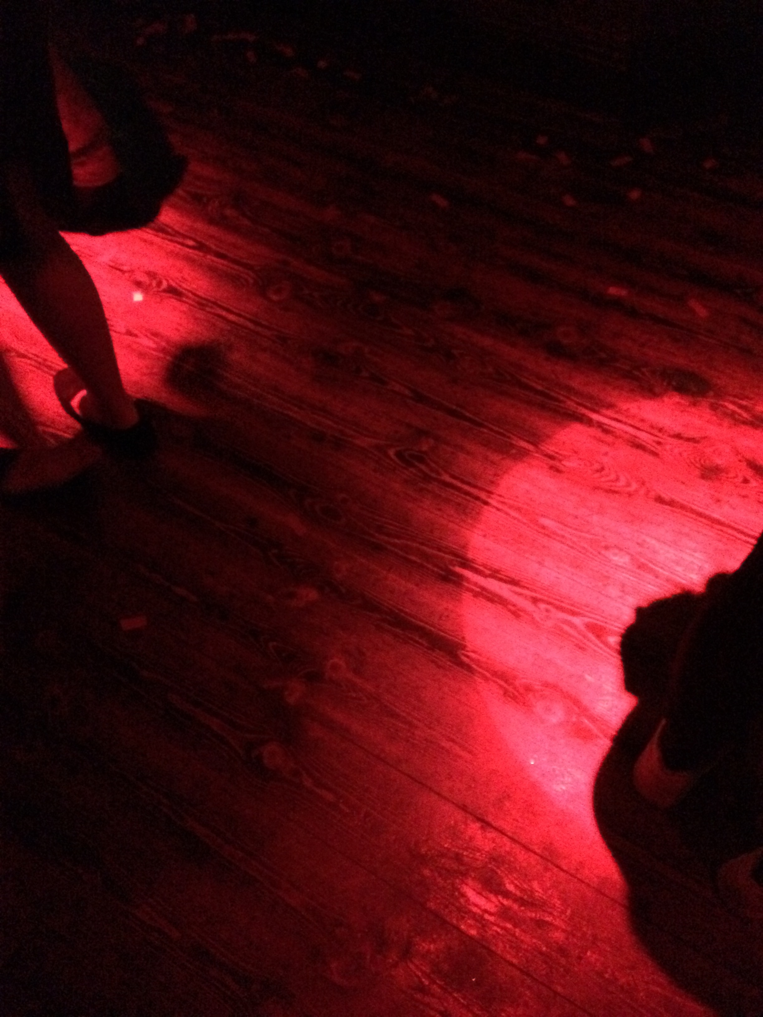
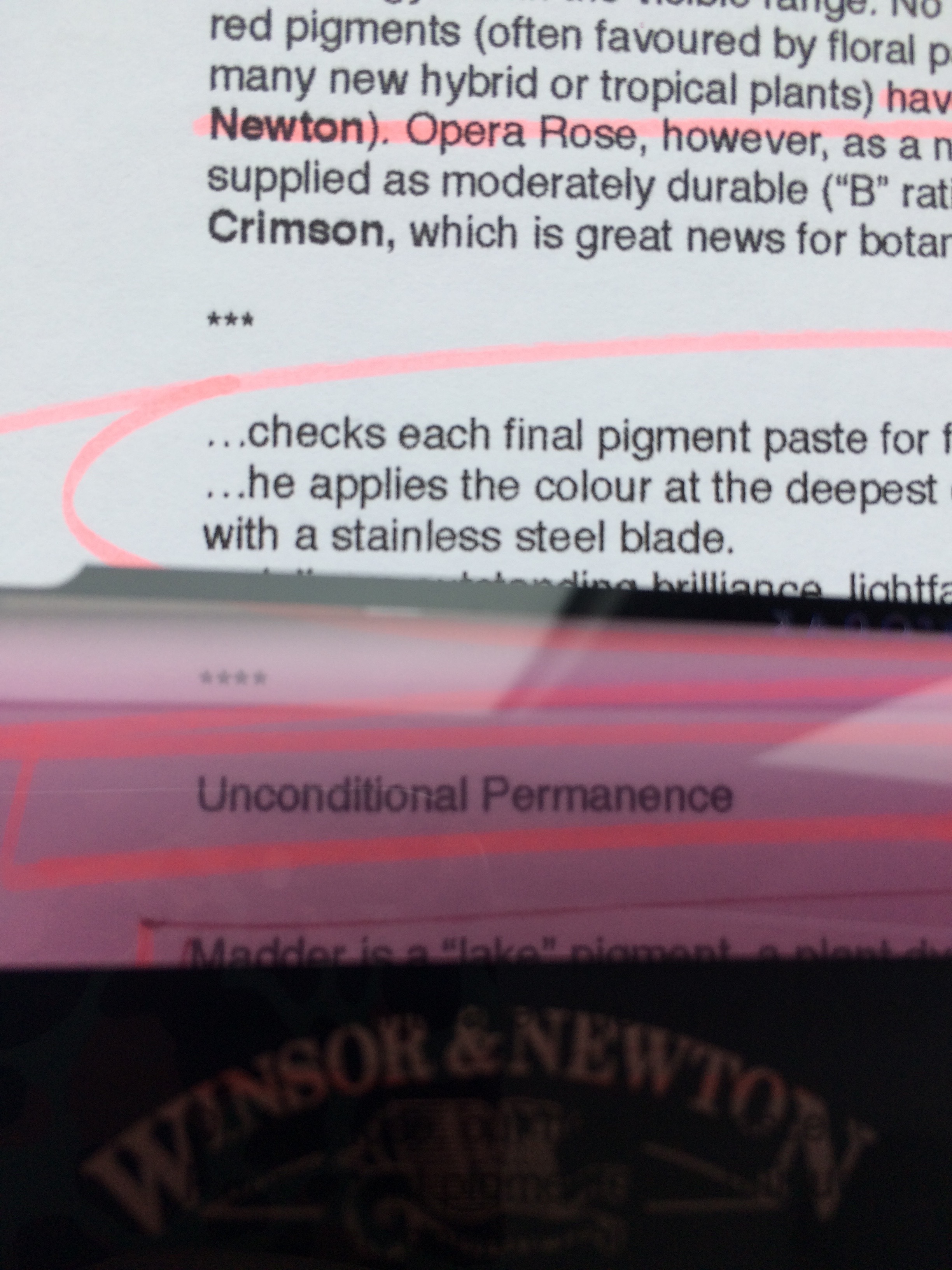
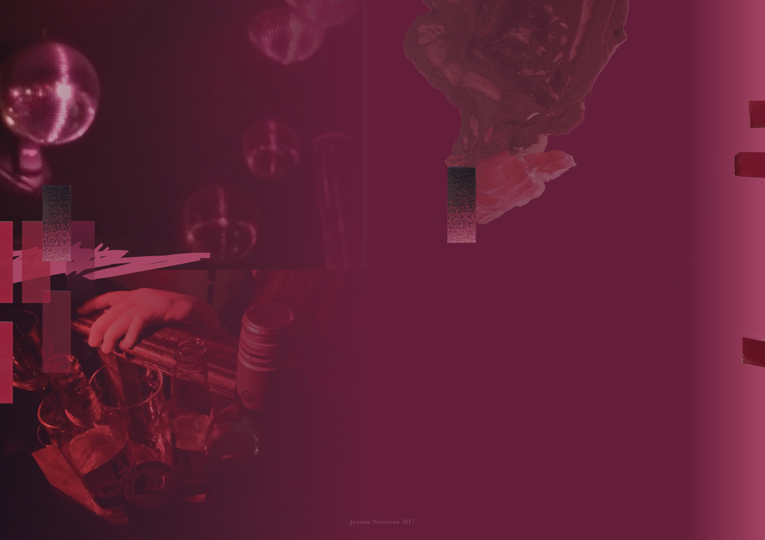
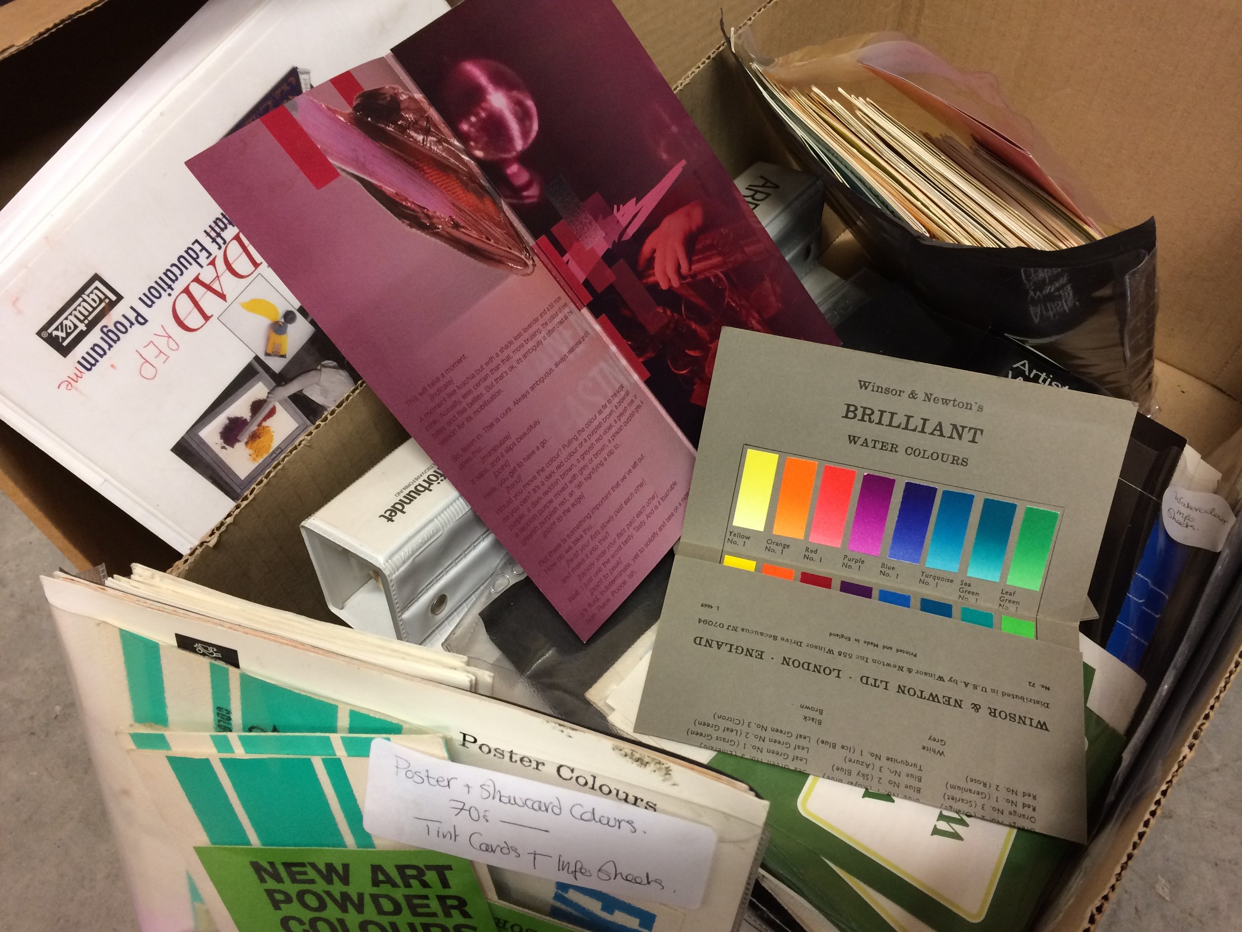
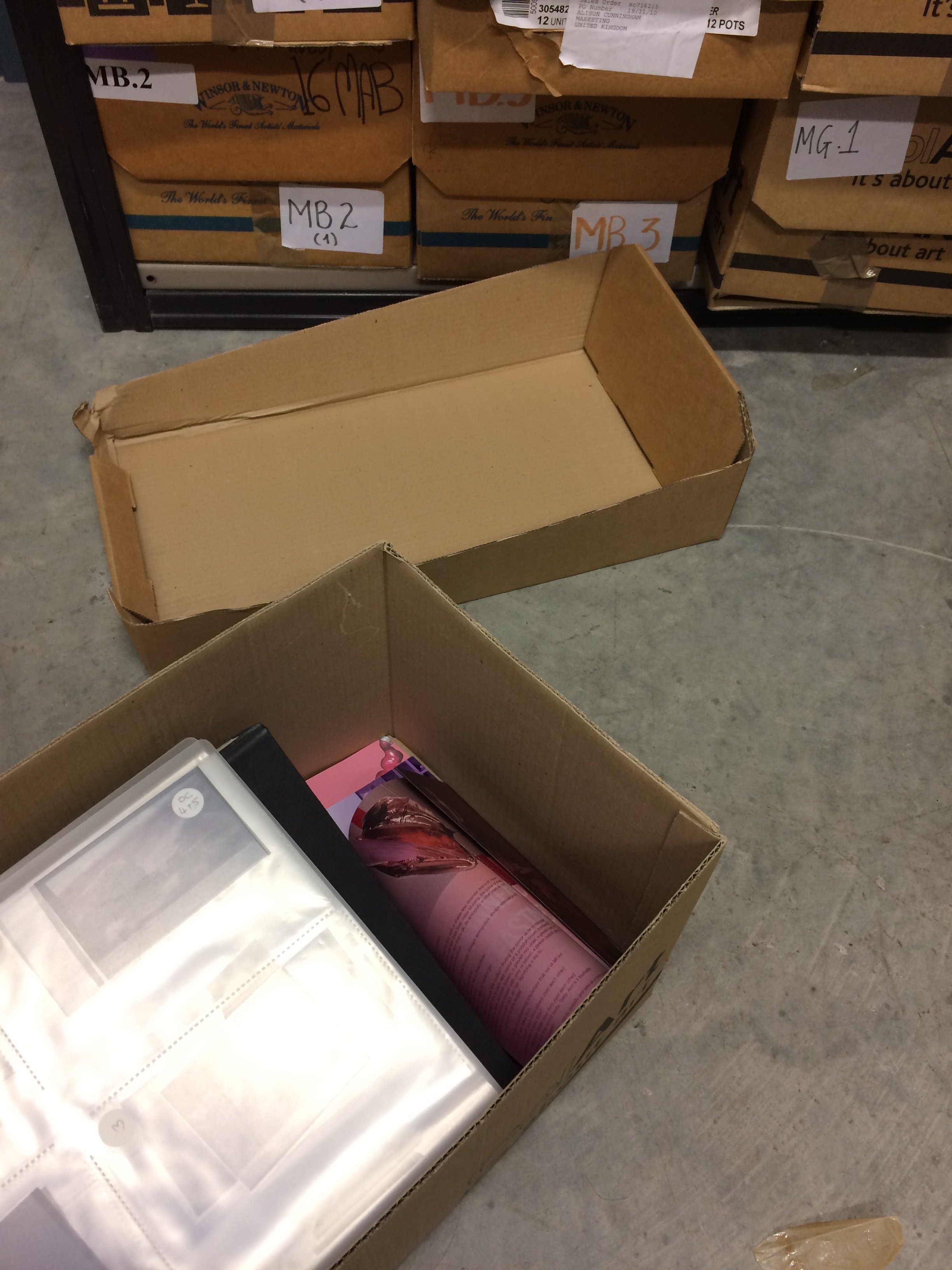
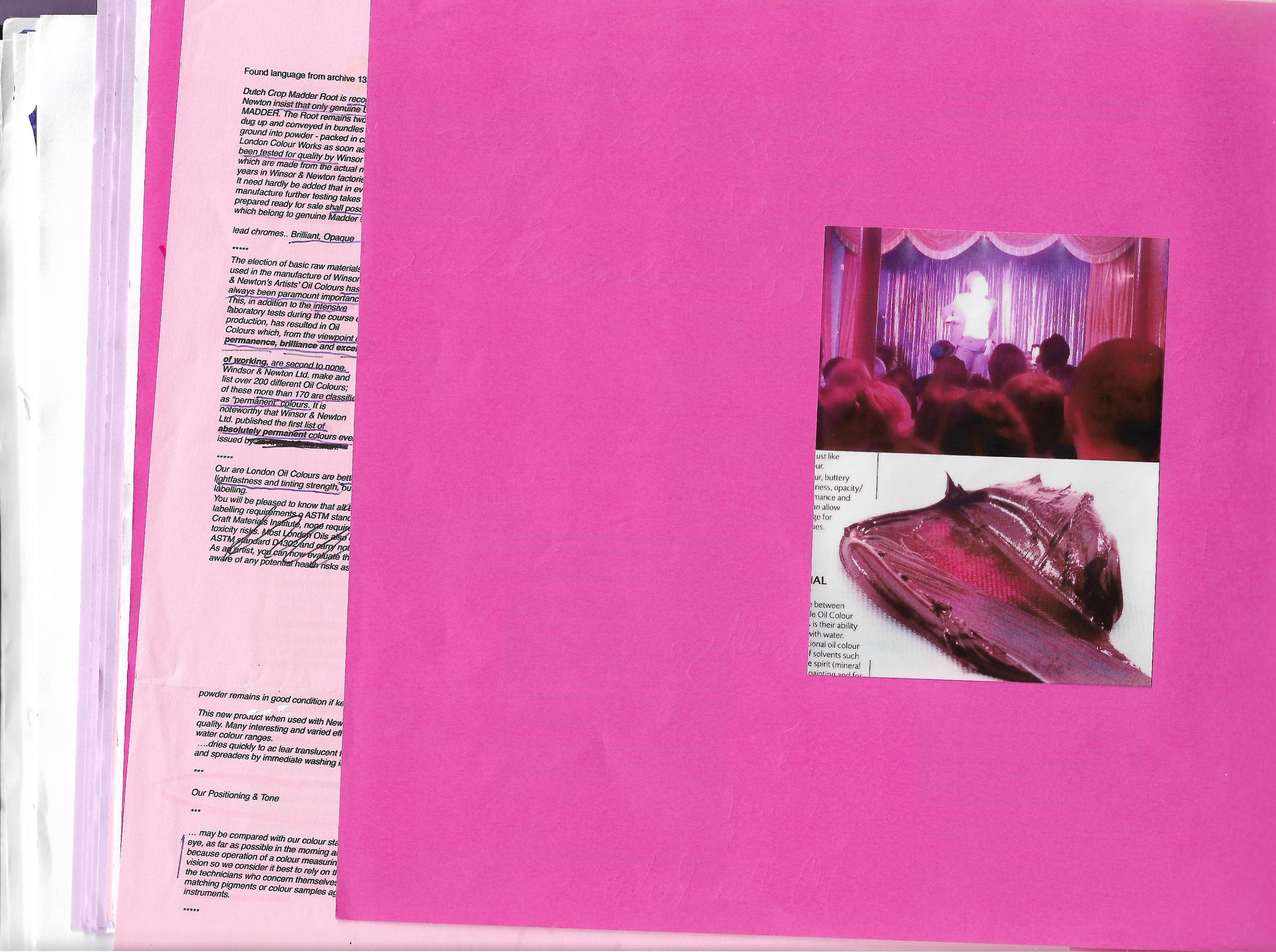
Not a residency of material experimentation undertaken in the studios, but a residency of research, pursued undercover through sporadic visits and working from a distance. It used the Winsor & Newton archive, office hot desking and listening-in to explore the language of colour marketing and pigment promotion. It used nights out, gossip and hidden archives to investigate the nomenclature of colour, and colour as queer signifier. To infiltrate the certainty of branding with the vulnerability of identity, it took place on the tube and across the city, as much as it in did ‘in residence’.
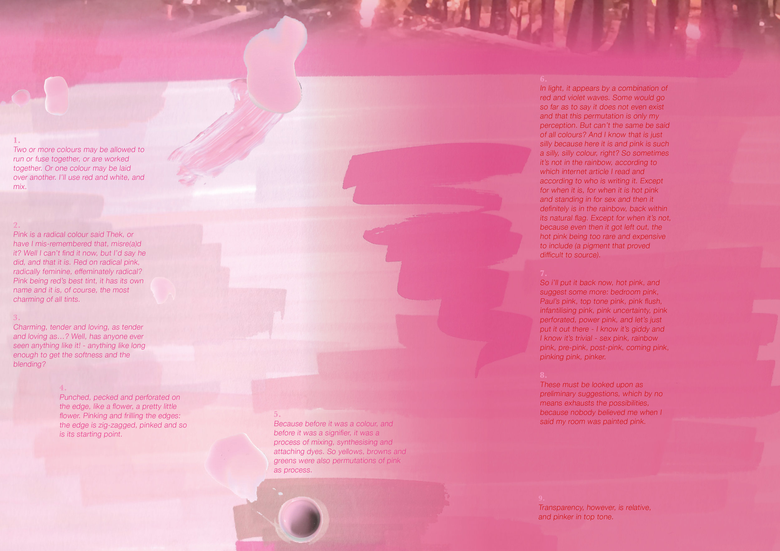
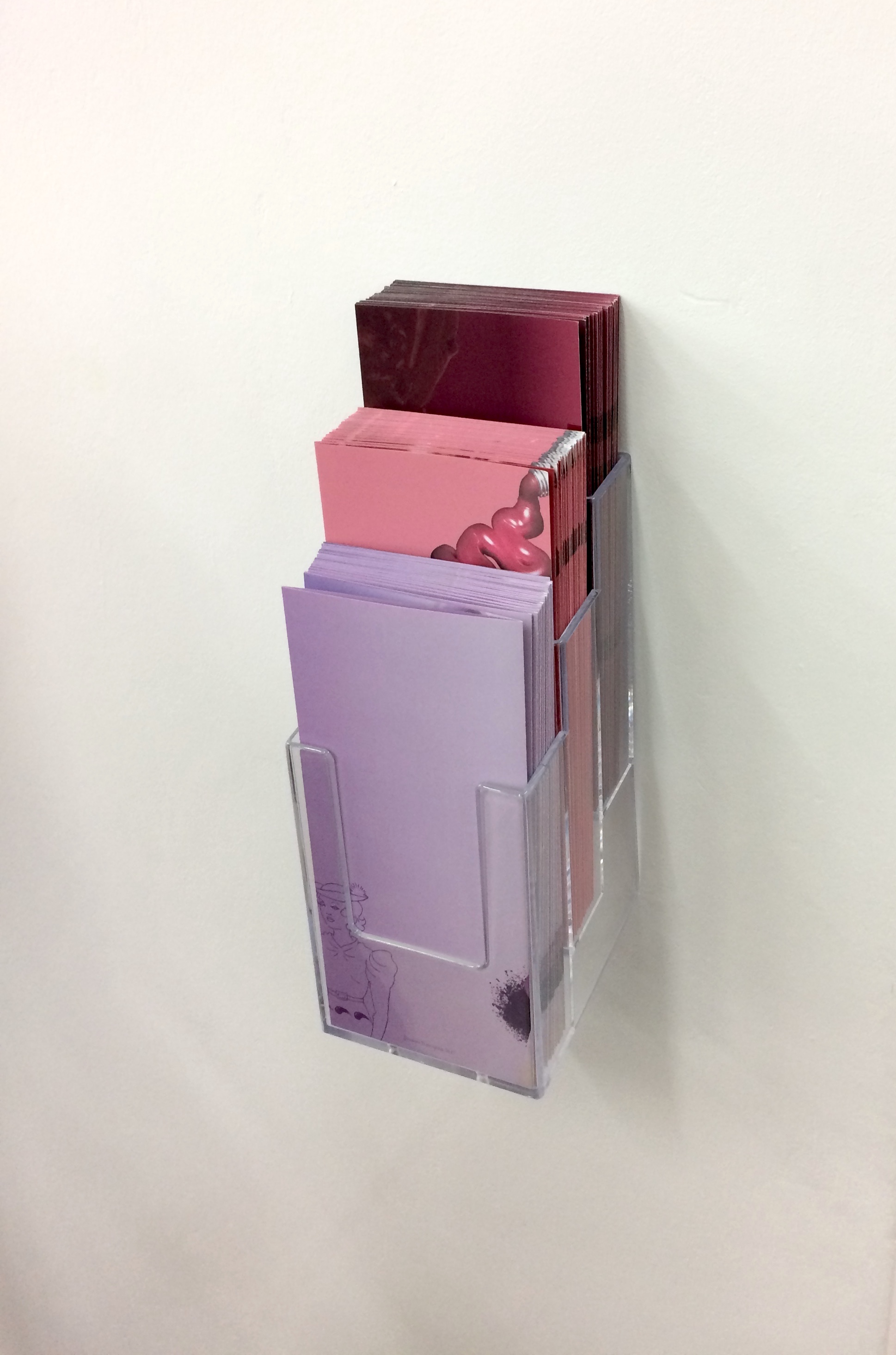
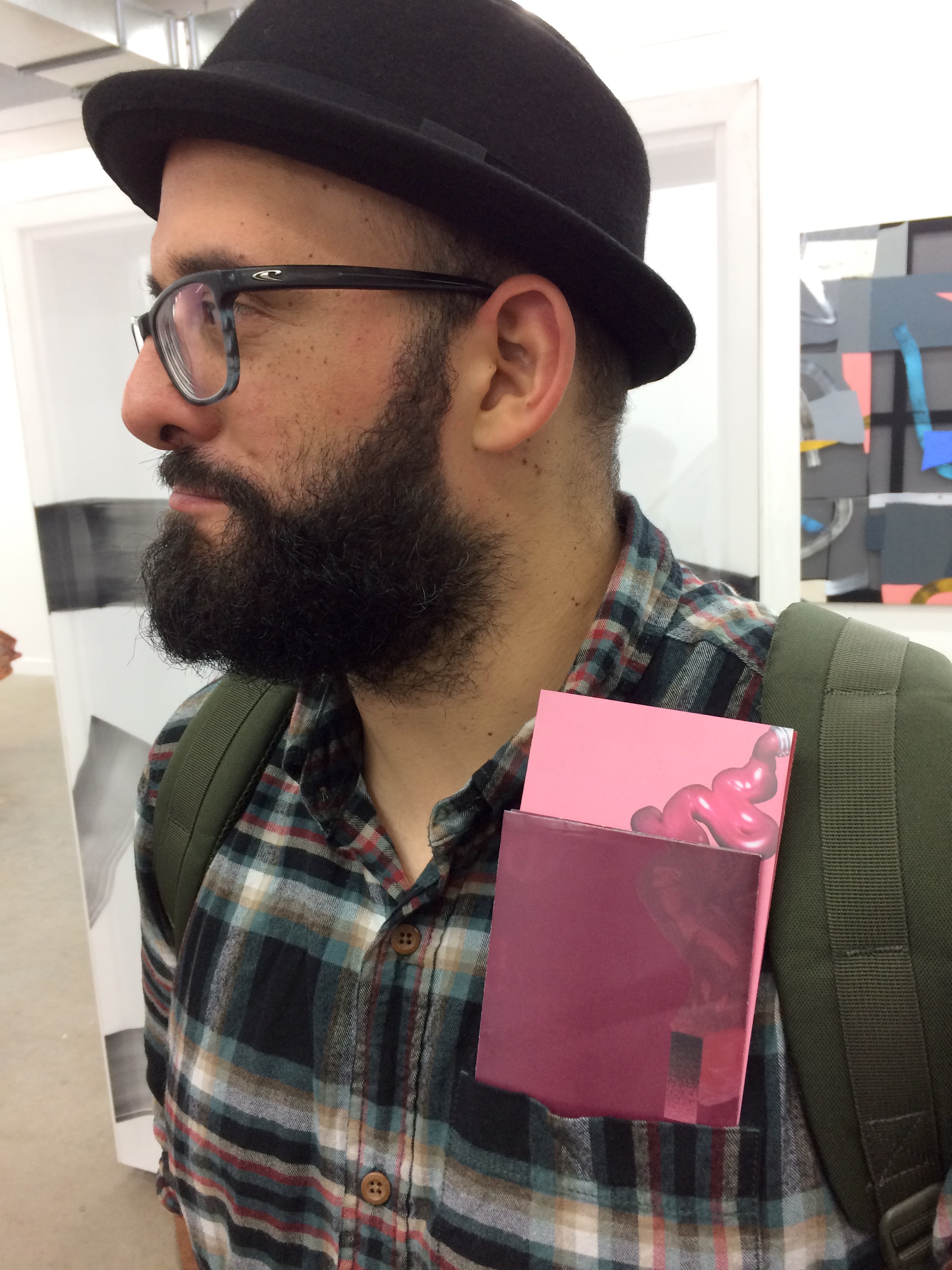
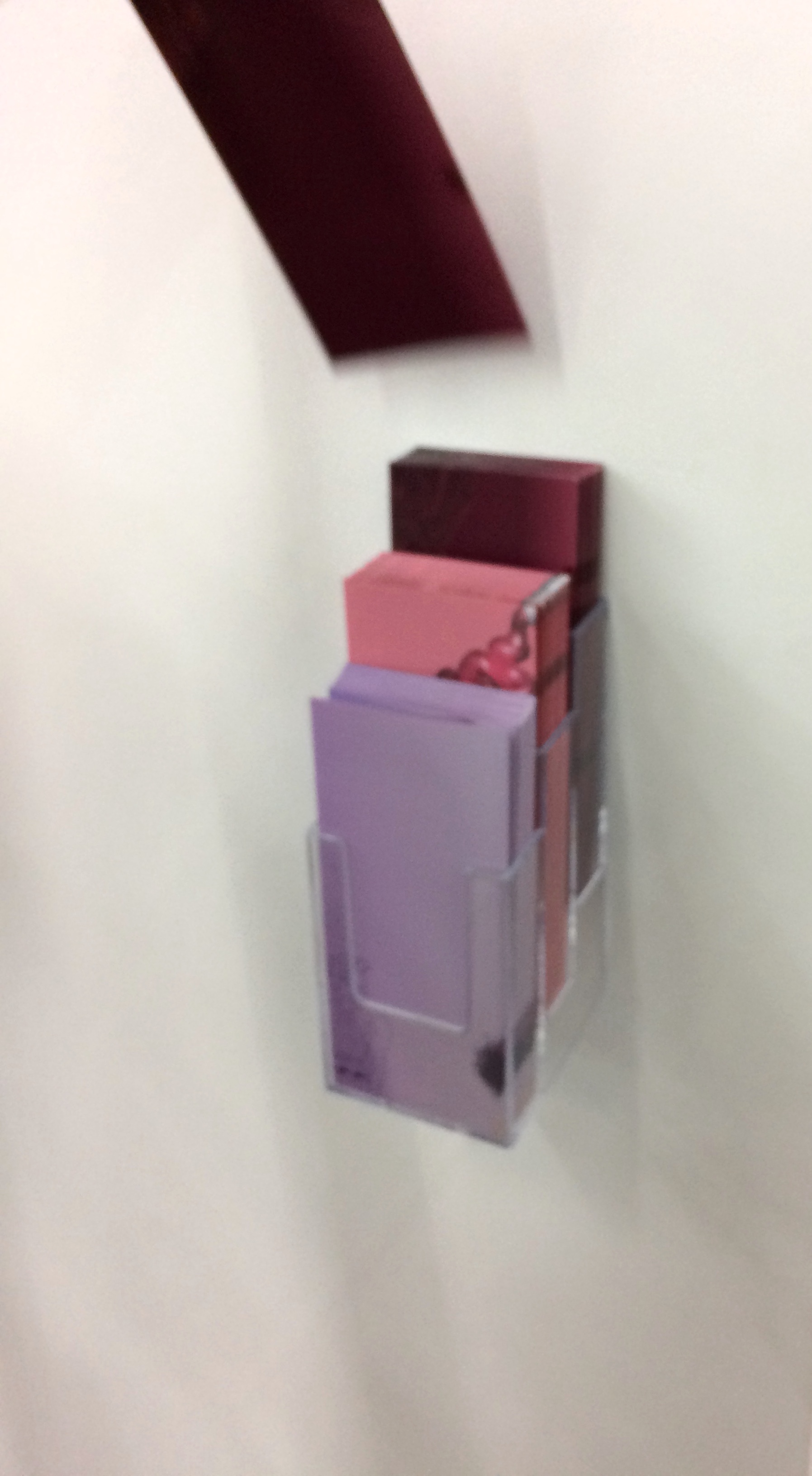
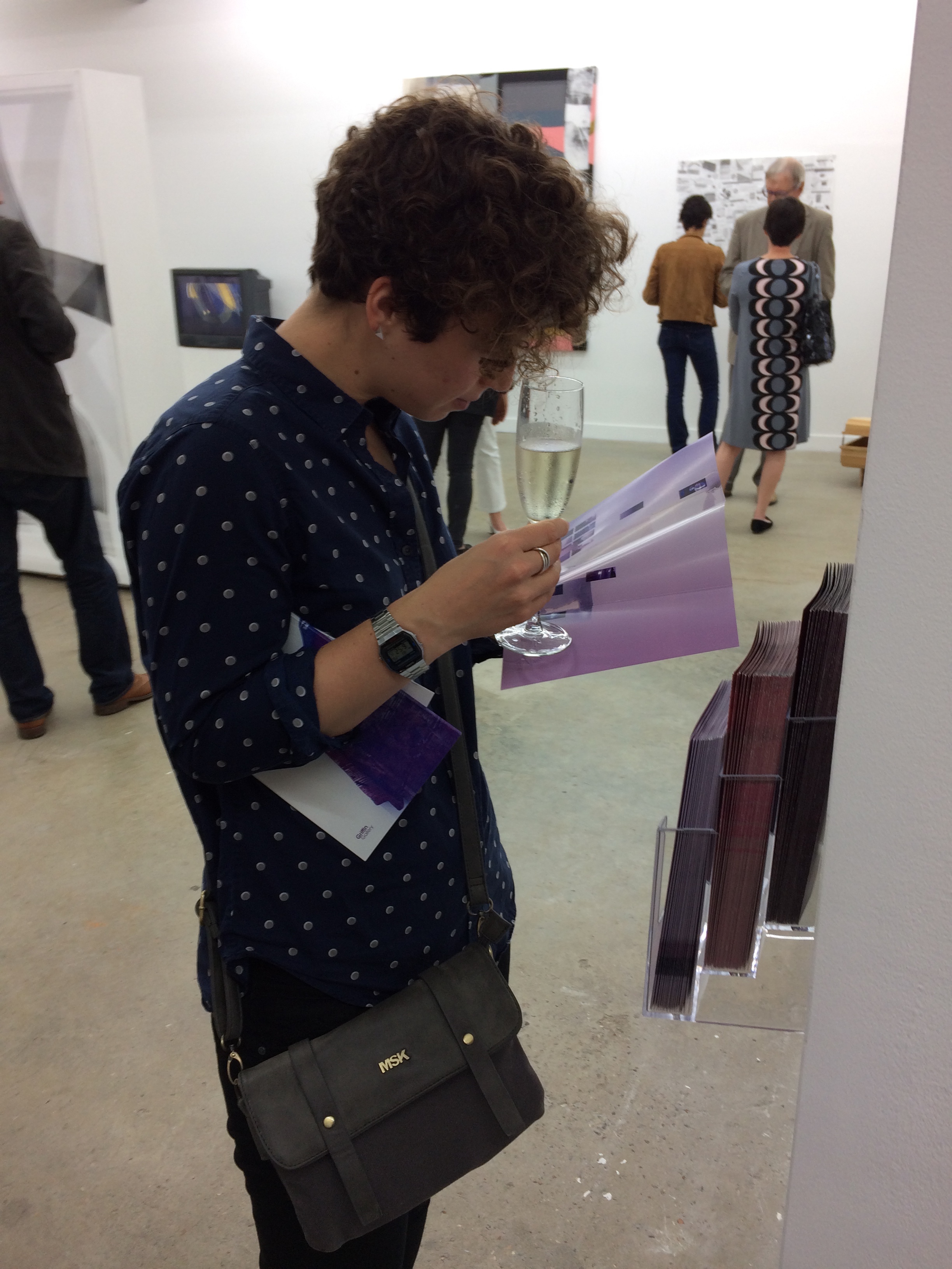
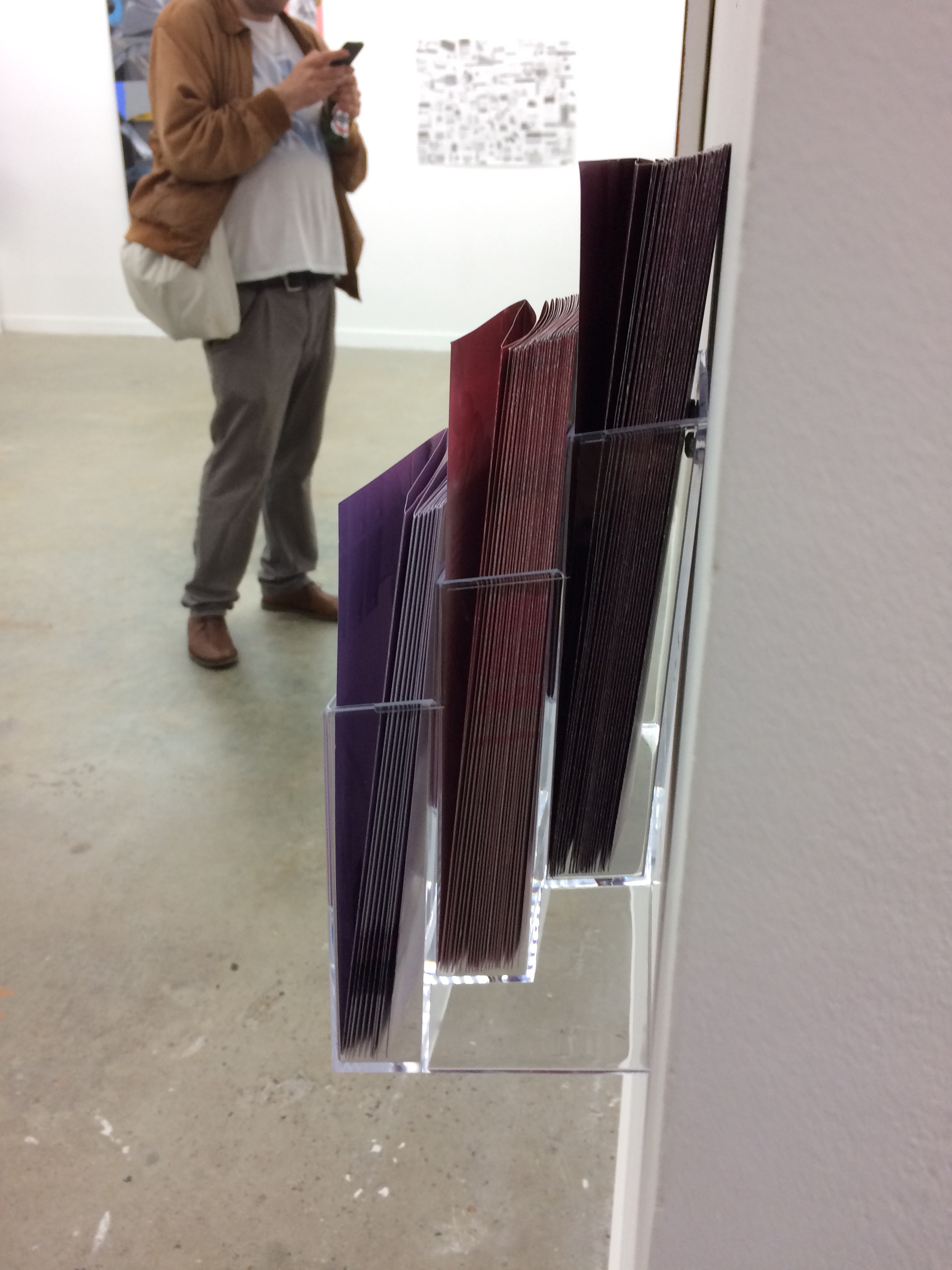
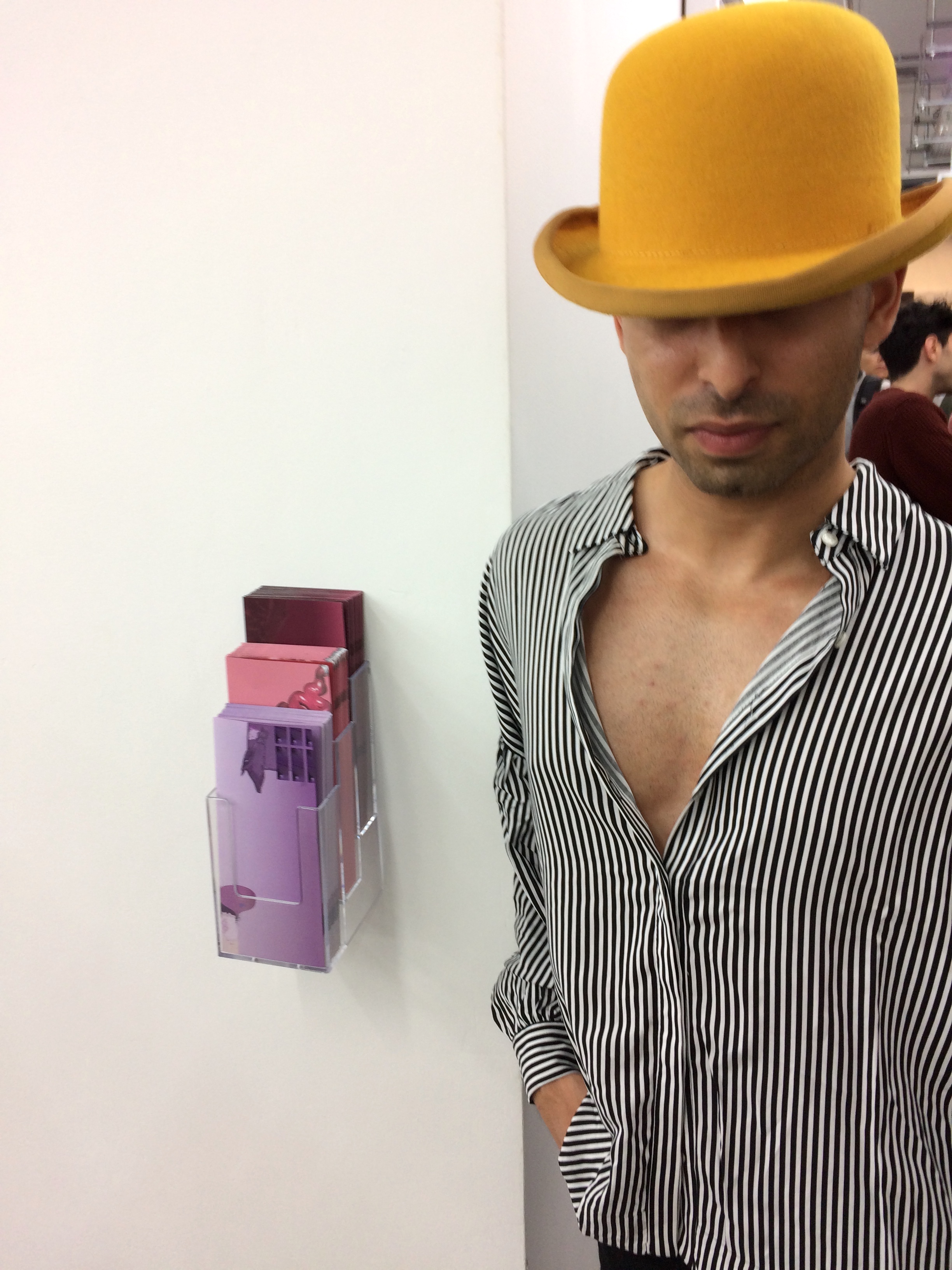
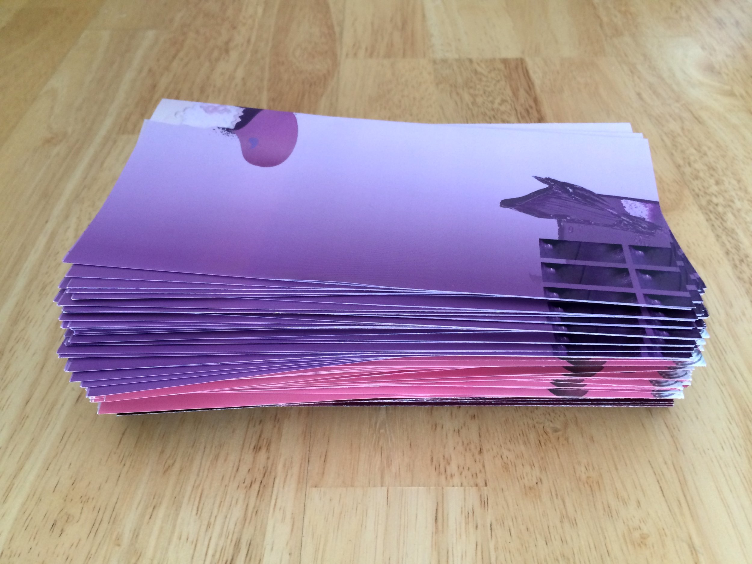
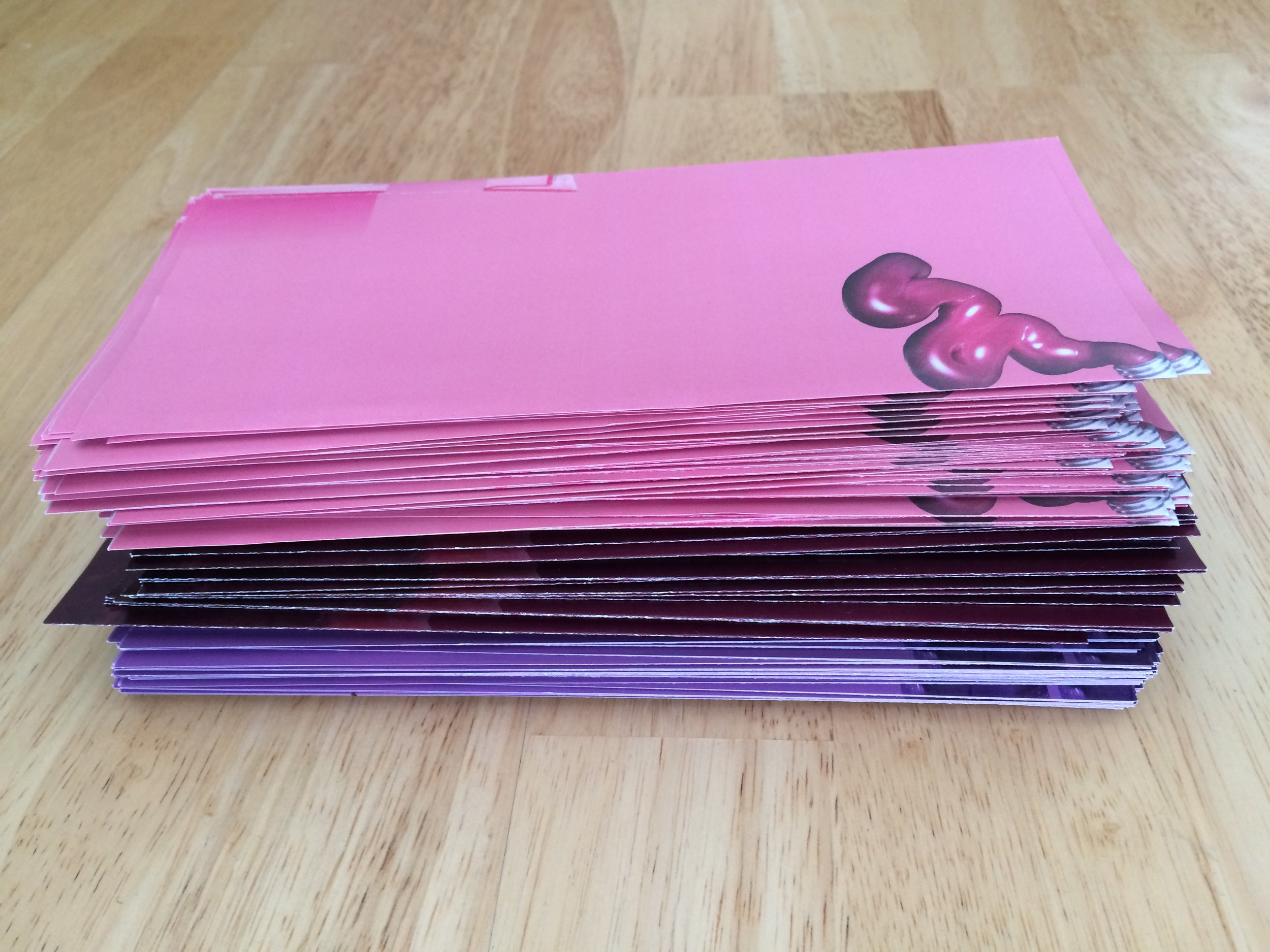
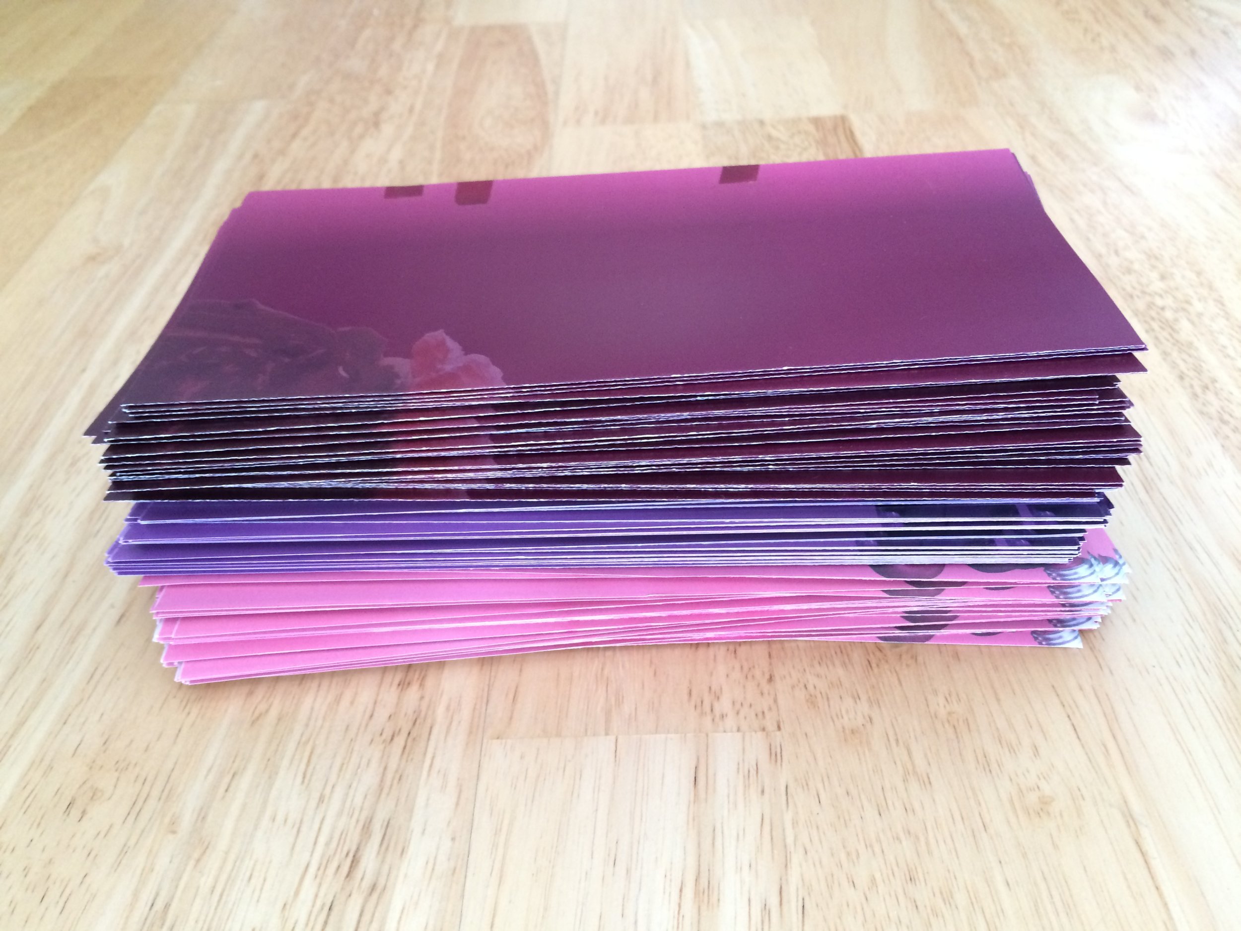
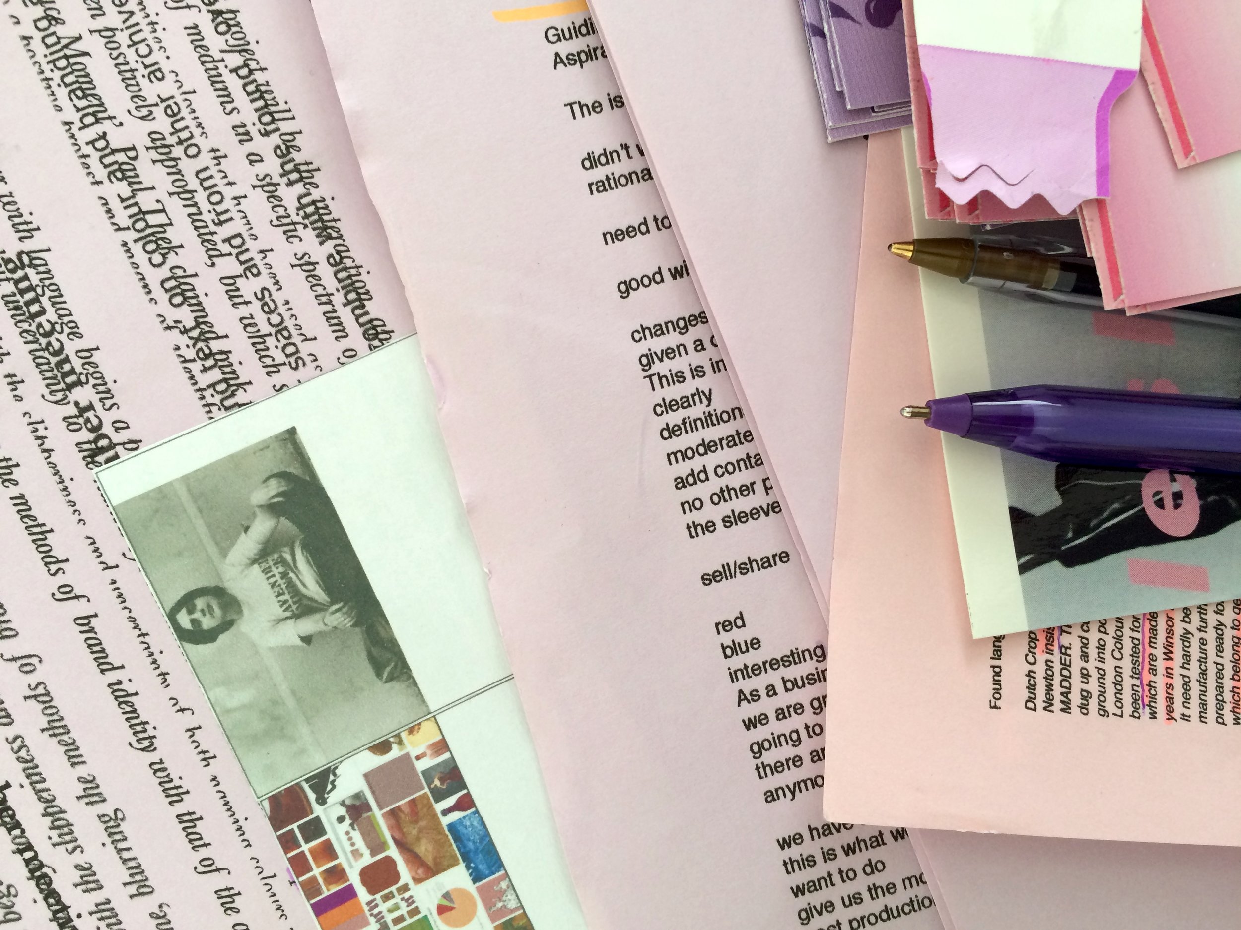
The outcomes and ongoing work borrow the promotional formats of information leaflets, tint cards and sales scripts to create new, ambiguous publications; official colours mixing with found colours, stolen language and appropriated imagery.
The edge is deviant. Pinked.
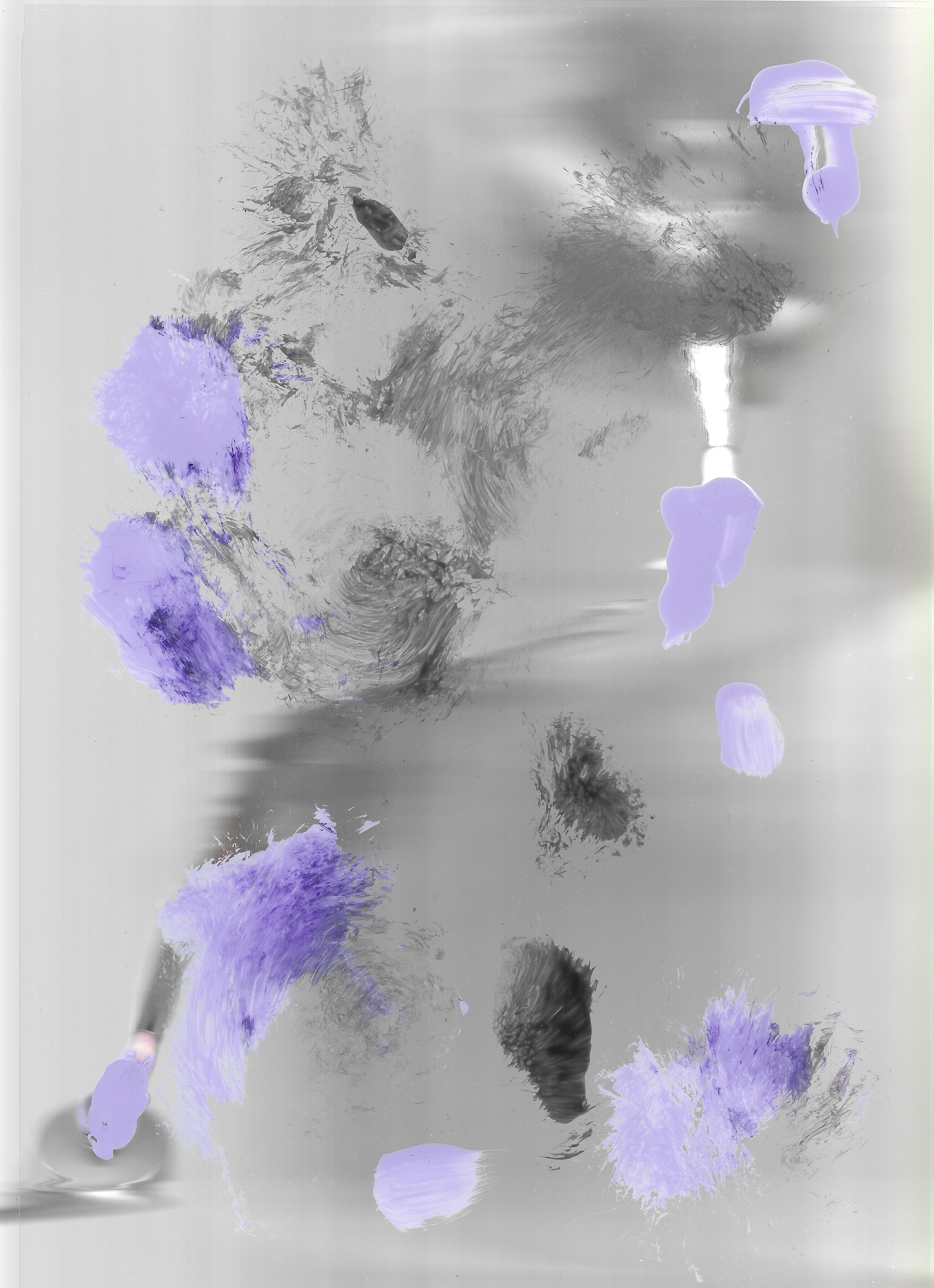
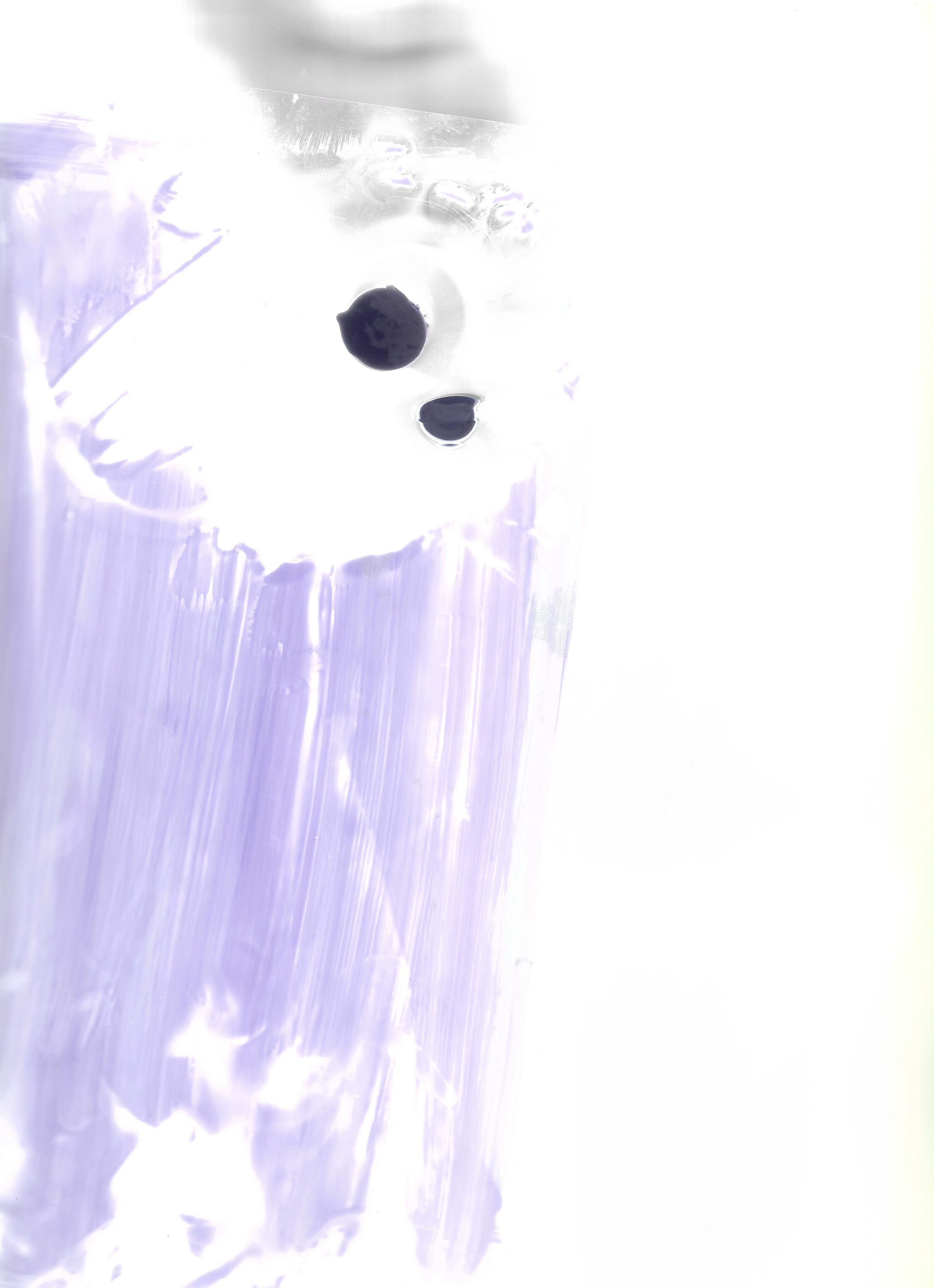
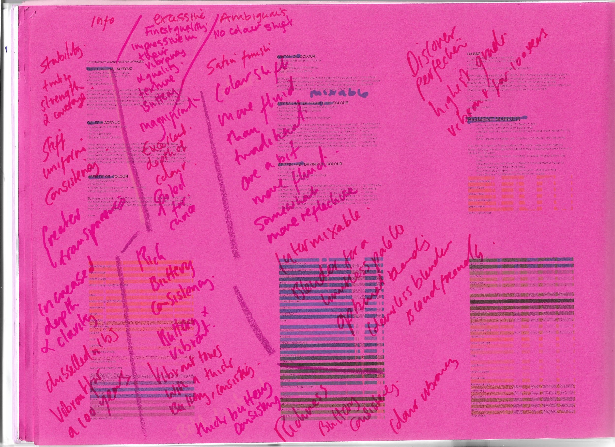
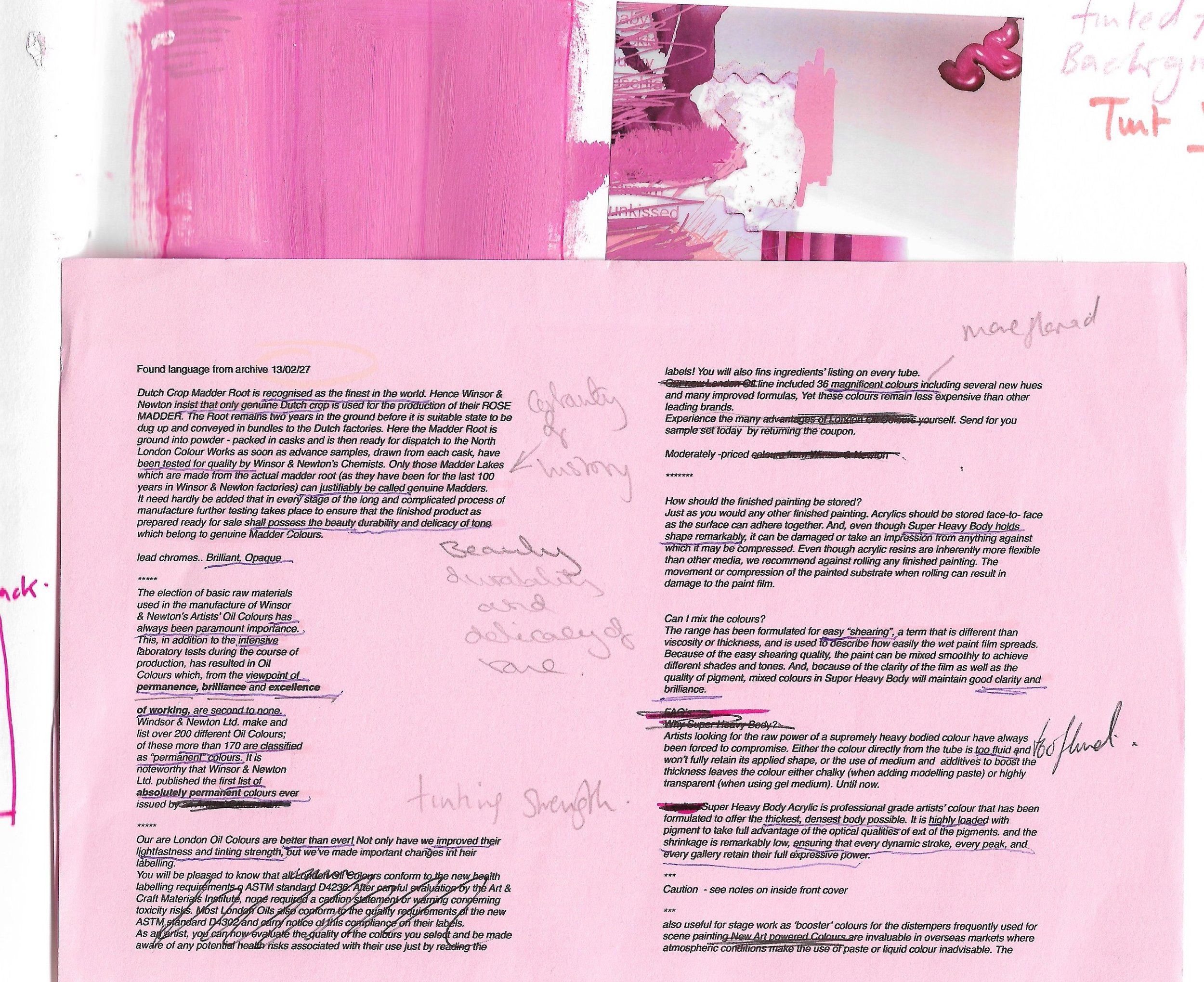
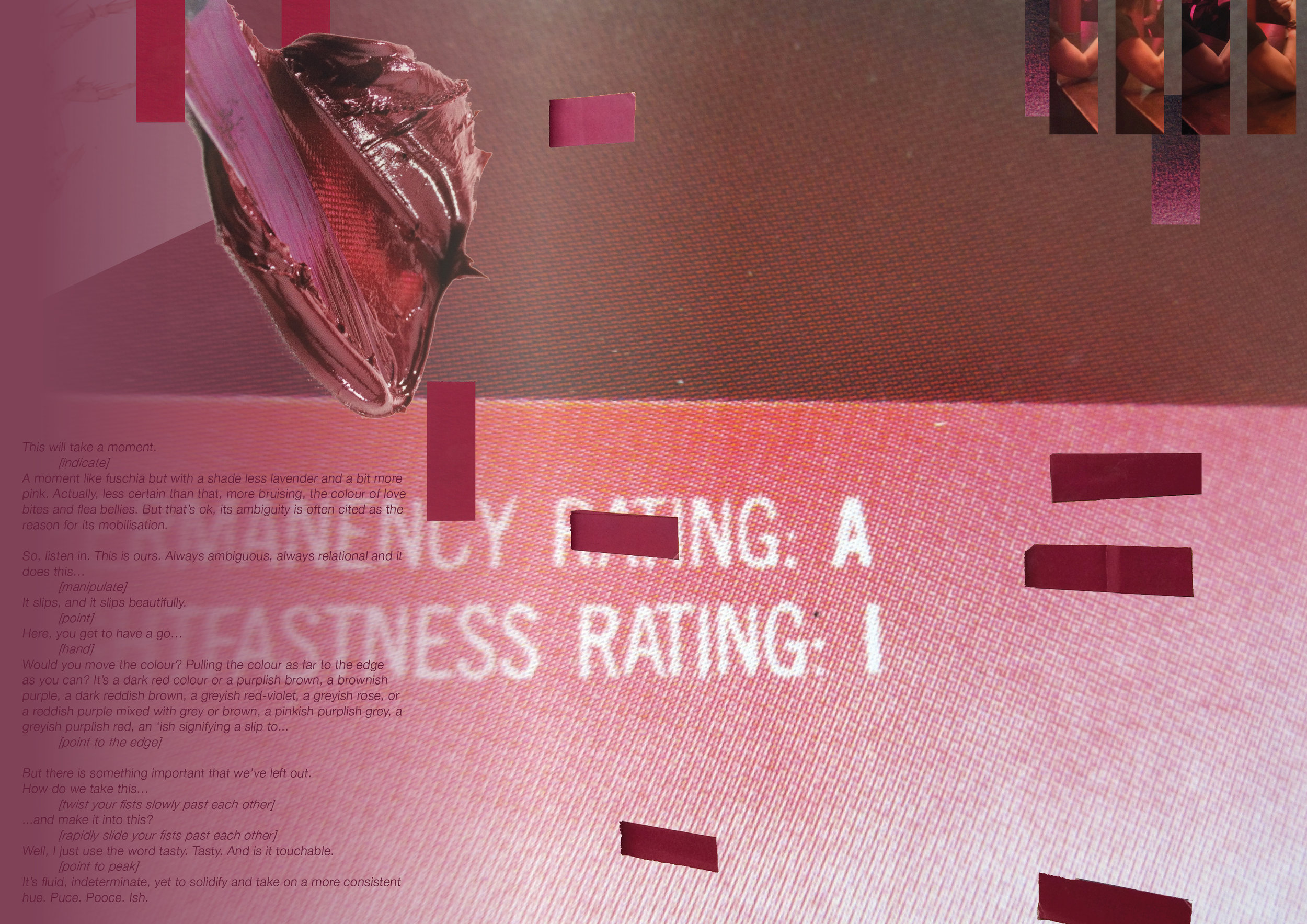
A kind of ambiguous / mis-information and a new uncertain nomenclature of colour - to be added to the certainty of branding identity, by infiltrating and queering the archive....Kind of Queering the marketing and finding the lavender, pink and puce in the archives and connecting those to found colours, colours on nights out. Out-out. Misinformed, ambiguous colours, seen from the edge. frilly edges. Uncertainty and instability. Sort of 'ish.